5 / Color Grid
To test how people become aware of color within complex photography, I showed participants a number of landscape photographs and asked them to pick out just two colors. This required a process of filtering out unnecessary information and selecting what was relevant to the task. I have often wondered what factors contribute to the efficient and intuitive recognition of colors.
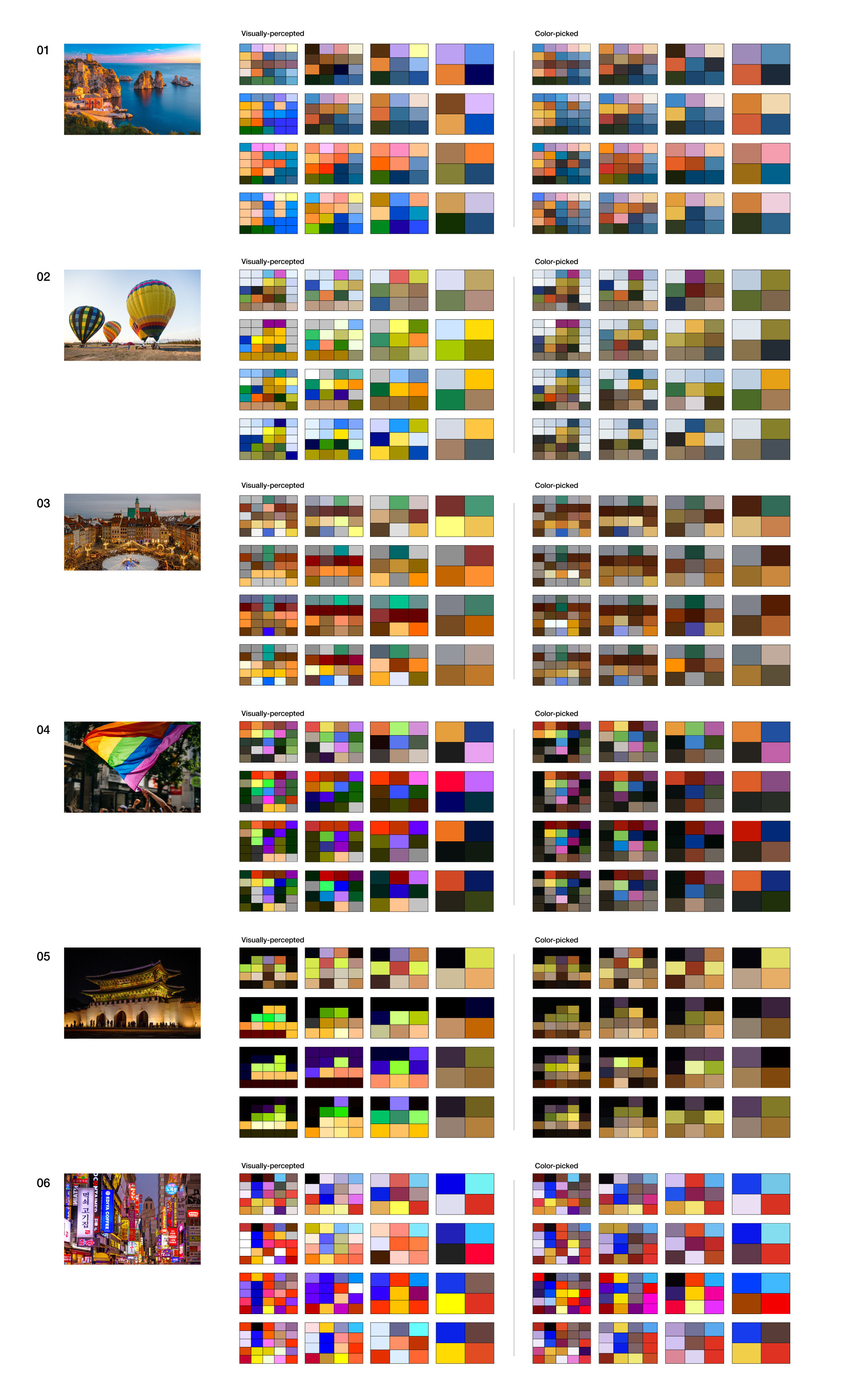
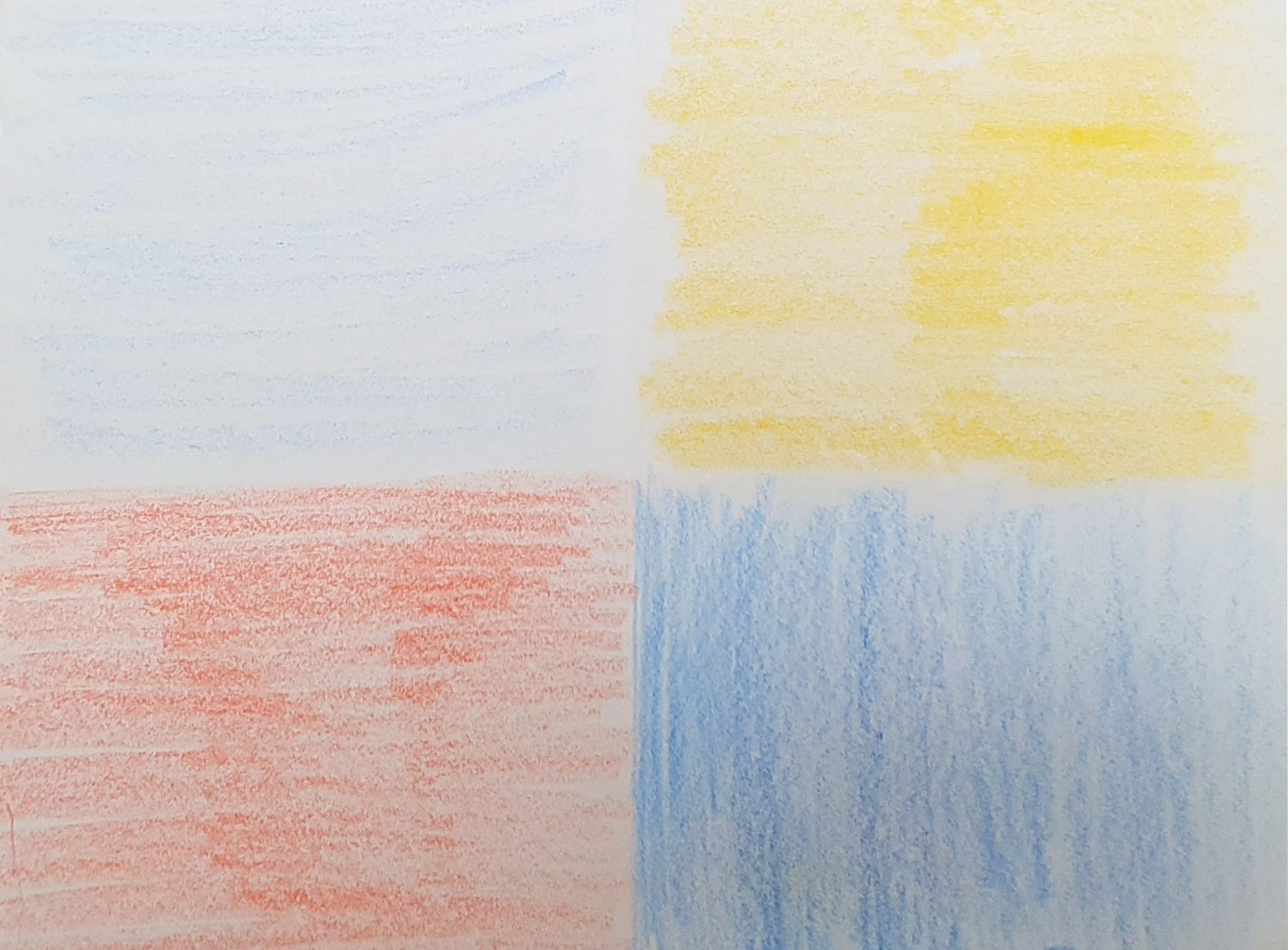
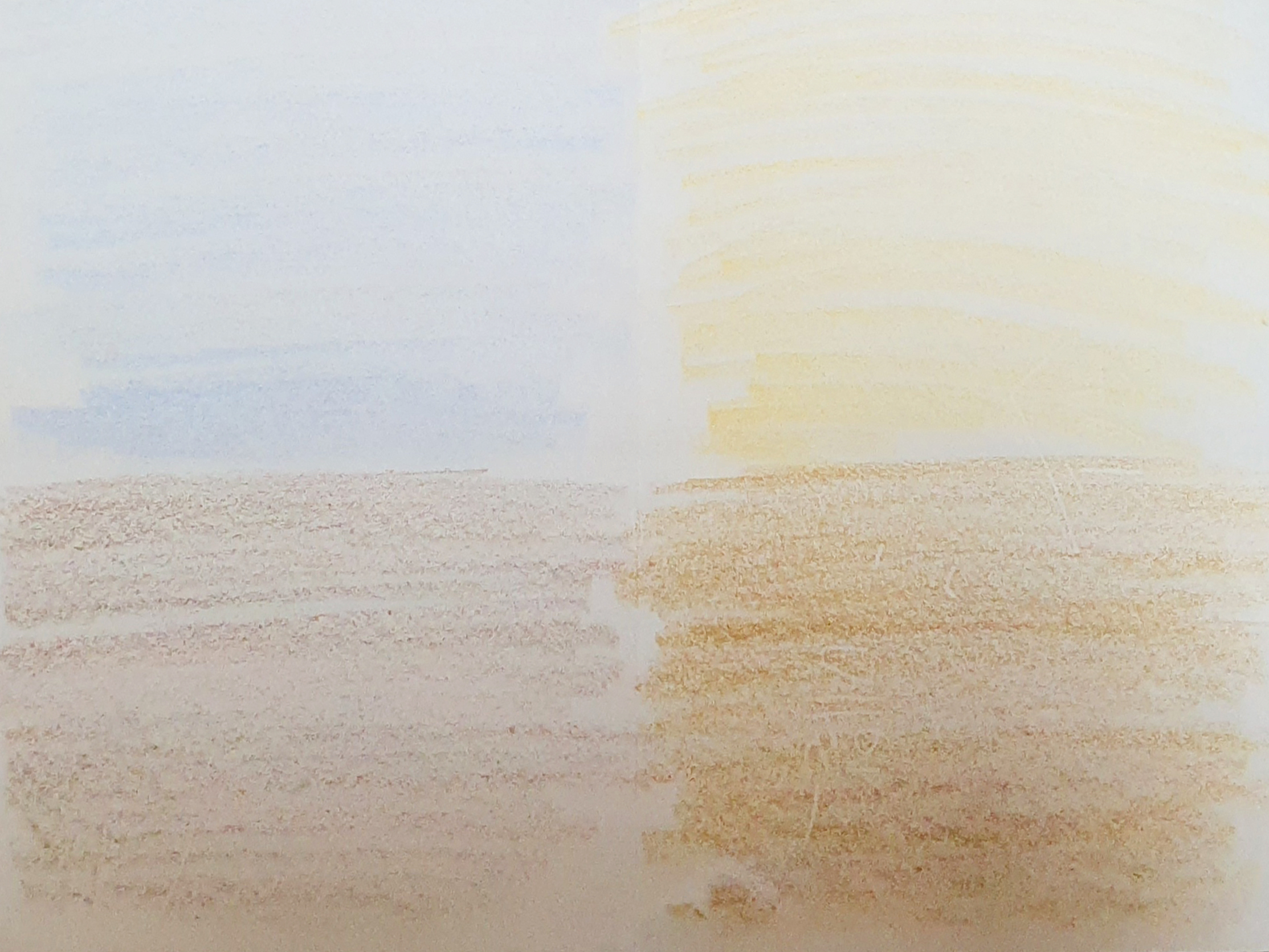
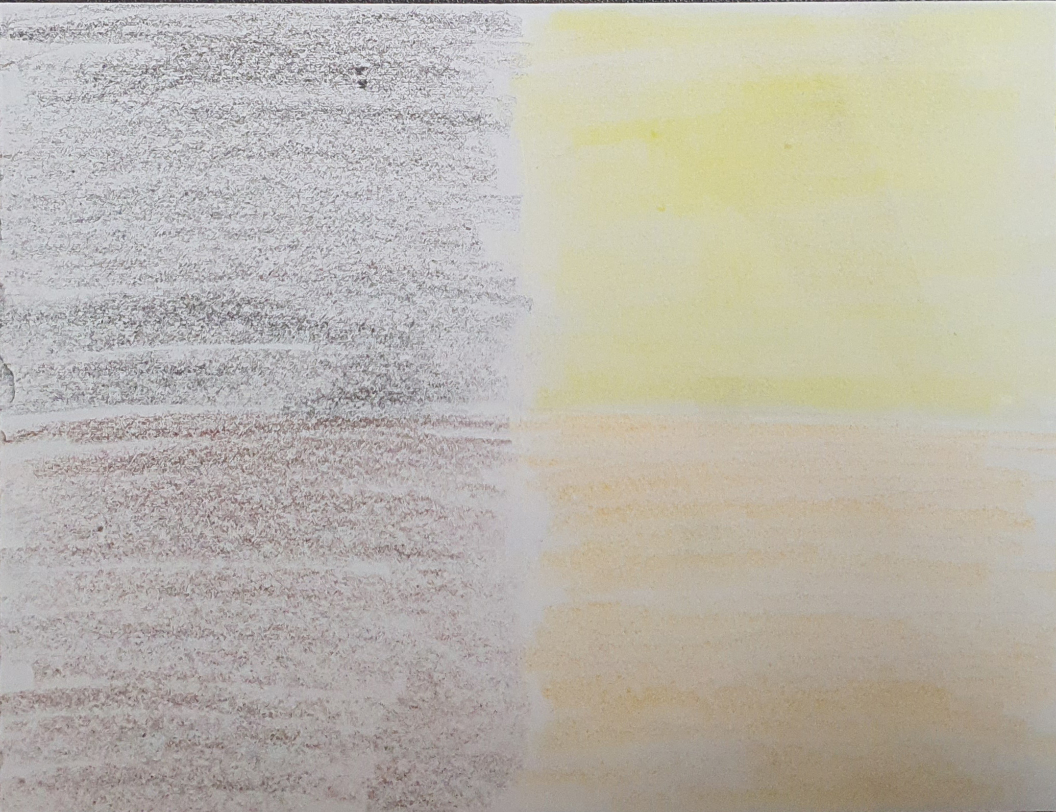
To guide participants in creating a simple and powerful visualization of the colors they had identified in the photographs and to experiment with different levels of schematization, I created a step-by-step process. The resulting color swatches made by the participants shown below display interesting variations in color perception.
To guide participants in creating a simple and powerful visualization of the colors they had identified in the photographs and to experiment with different levels of schematization, I created a step-by-step process. The resulting color swatches made by the participants shown below display interesting variations in color perception.


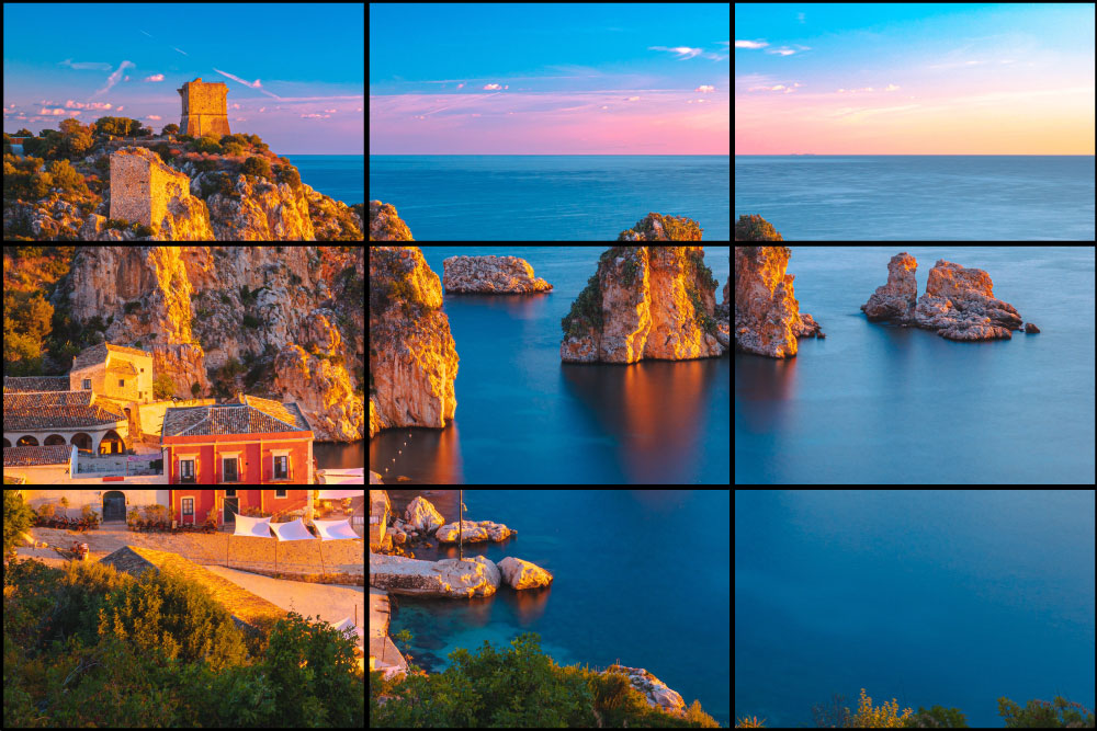

The simpler the grids became, the more schematization took place. Using such a process, we can find out how people recognize the dominant color within a given section of a photo according to how much intensity and space they assign to it when coloring the grid.
Data Acquisition
Hypothesis
I hypothesized that, even in the absence of any defect in color perception (e.g., color blindness), there will be differences in the color that each person perceives most strongly when looking at the same landscape picture.
Experiment Subjects
I wanted to avoid receiving the uniform results that would likely be given by subjects who were trained in color selection and who had a highly developed sense of color. To this end, the group of test subjects was composed of people of different ages and professions, such as engineering, accounting, finance, and design. In this way, I tried to gather results that would be broadly representative and not biased in the direction of those with a good sense of color or those without.
Instructions
There were three steps of the whole experiment.
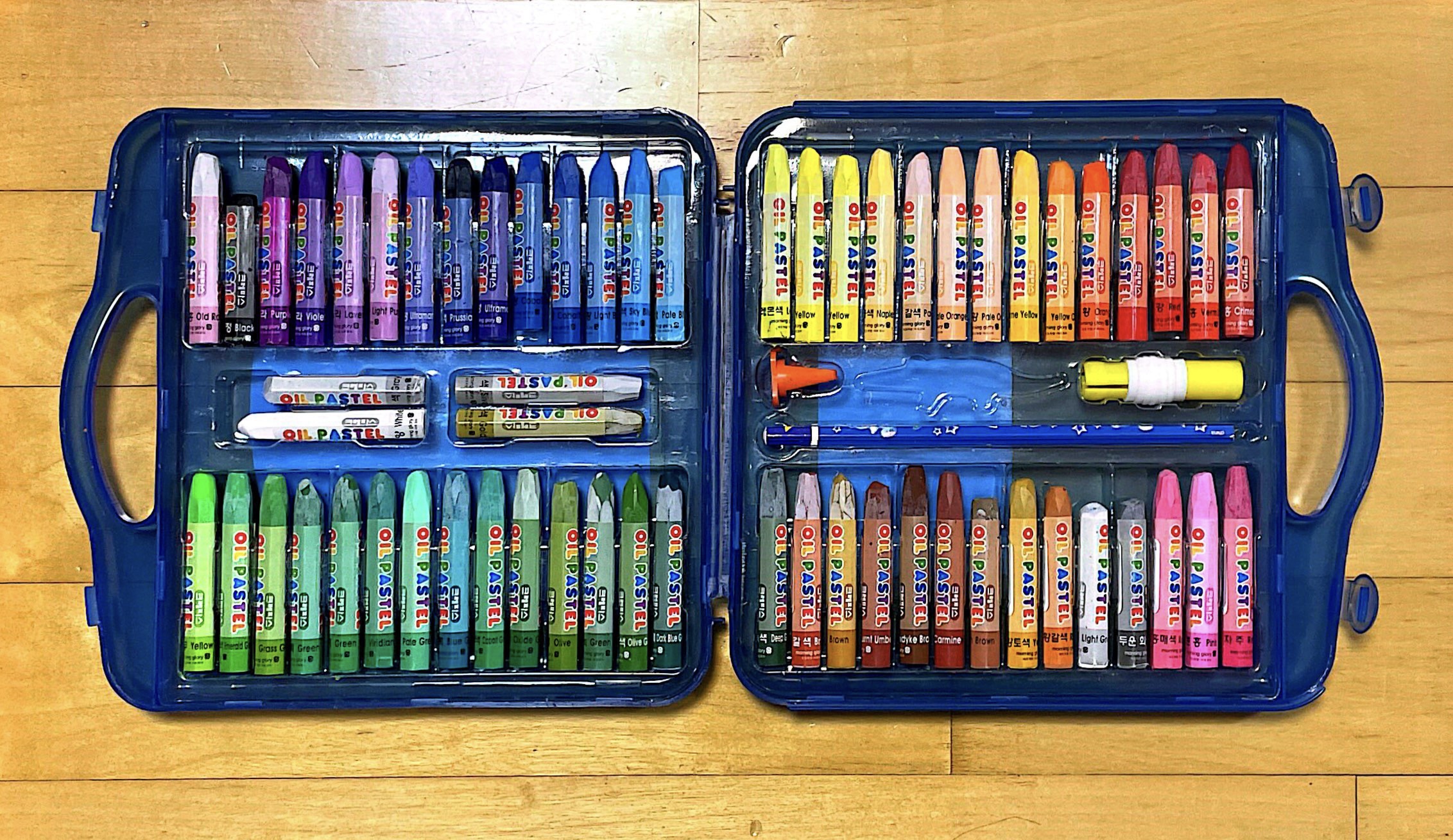
1) First step : Coloring the divided section with 32 color crayons by hand. Providing a limited choice of colors made test subjects think less and be more prompt.
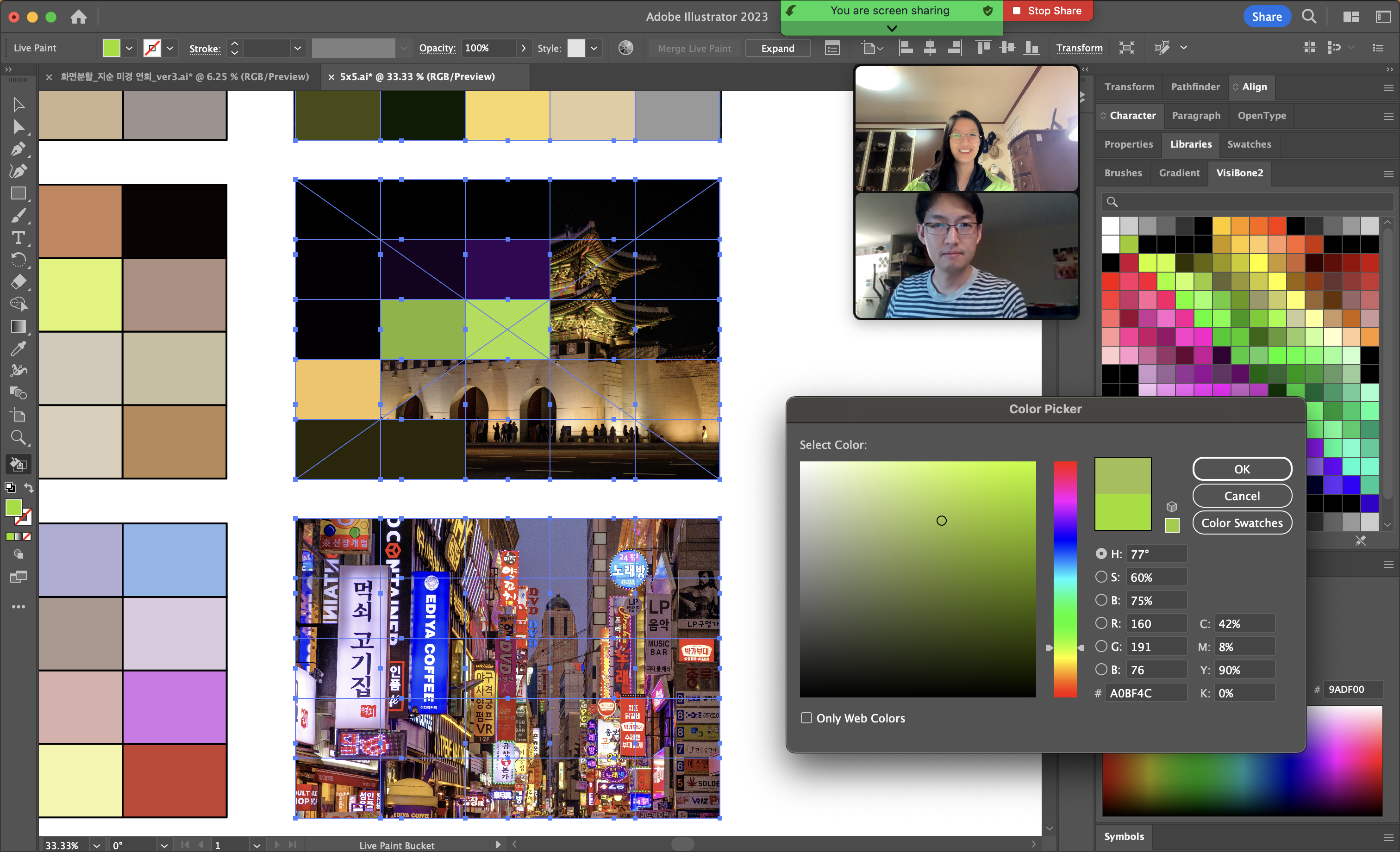
2) Second step : Digitally coloring Visually-perceived color on the section of the example - by mixing the colors on one’s own or selecting from the swatch in Adobe Illustrator. Color picking tool(Eyedropper) is not available.
3) Third step : Digitally coloring the section of the example - by color picking tool(Eyedropper) in Adobe Illustrator. No editing or mixing the color after is not allowed.
I tried to exclude the intervention of the external environment as much as possible. The test subjects were given the same tasks, with the minimum instructions and restrictions.
Through this, it was intended to be more objective and to be able to produce results in which each individual's individuality was intact.
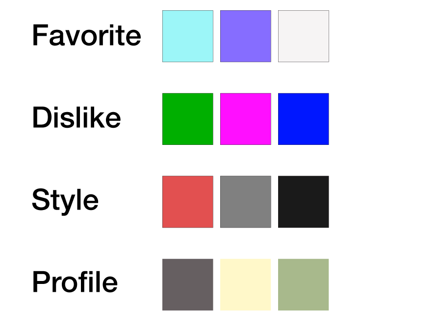
When picking a suitable color for each section of the photo, test subjects were to pick a color freely. Therefore, the results below are the result derived according to each person's free standards such as specific location/color distribution/color brightness on one’s wish.


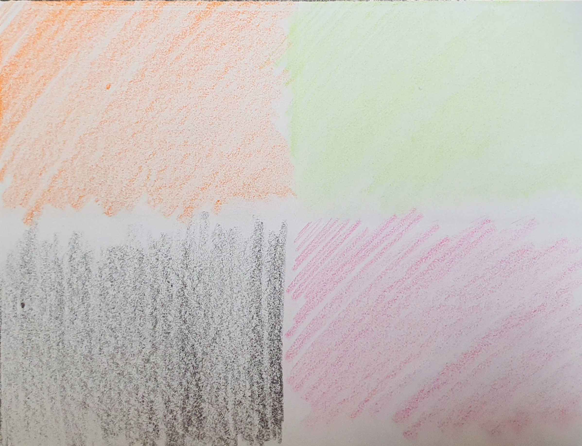
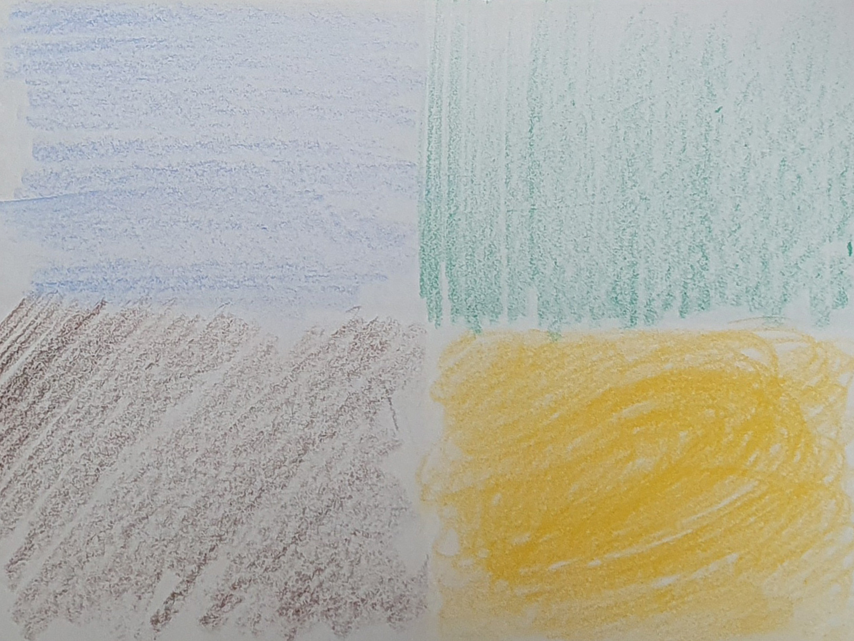
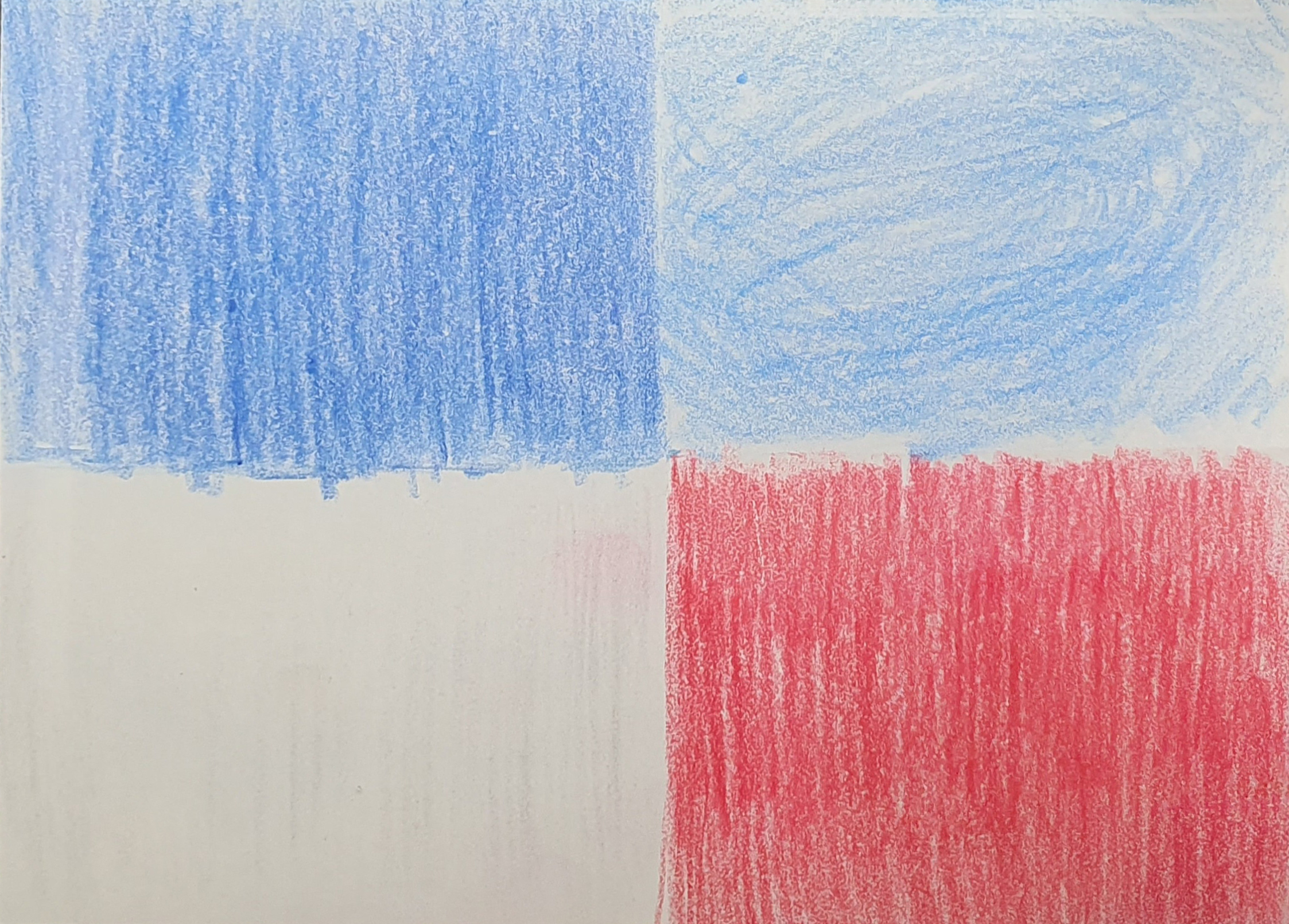


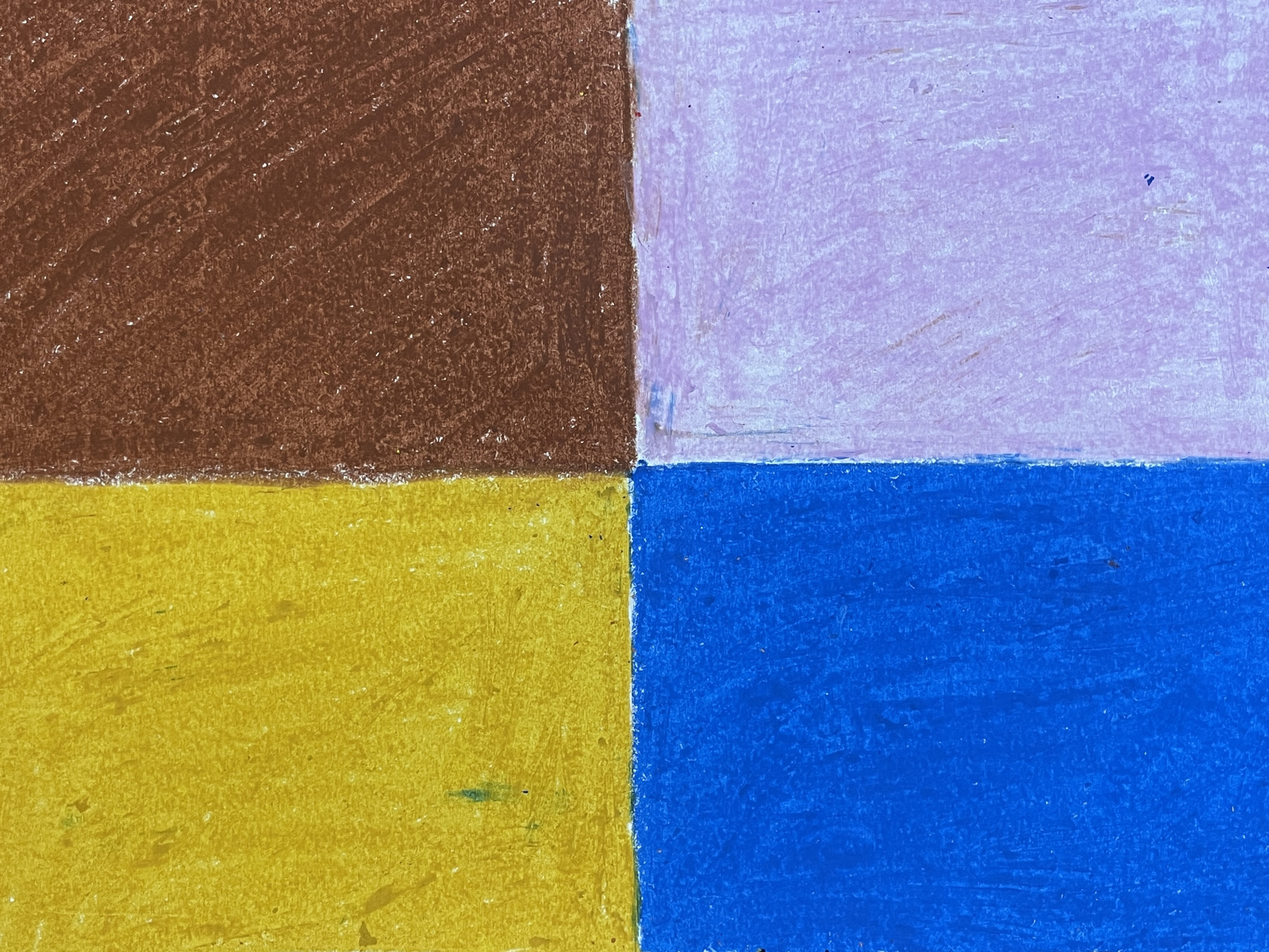


Final Output
